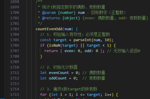
vue实现统计图
Vue 中实现统计图的常见方法
在 Vue 项目中实现统计图,通常需要借助第三方图表库。以下是几种主流方案及其实现方式:
使用 ECharts
ECharts 是百度开发的强大图表库,支持多种统计图表类型。
安装依赖:
npm install echarts vue-echarts基础示例代码:
<template>
  <div ref="chart" style="width: 600px; height: 400px;"></div>
</template>

<script>
import * as echarts from 'echarts';

export default {
  mounted() {
    const chart = echarts.init(this.$refs.chart);
    chart.setOption({
      title: { text: '示例折线图' },
      xAxis: { data: ['周一', '周二', '周三'] },
      yAxis: {},
      series: [{ type: 'line', data: [5, 20, 36] }]
    });
  }
};
</script>
使用 Chart.js
Chart.js 是轻量级的图表库,适合简单场景。
安装依赖:
npm install chart.js vue-chartjs折线图实现:
<template>
  <line-chart :chart-data="data" :options="options"/>
</template>

<script>
import { Line } from 'vue-chartjs';

export default {
  extends: Line,
  data() {
    return {
      data: {
        labels: ['1月', '2月', '3月'],
        datasets: [{
          label: '销售额',
          data: [300, 500, 200]
        }]
      },
      options: { responsive: true }
    };
  },
  mounted() {
    this.renderChart(this.data, this.options);
  }
};
</script>
使用 D3.js
D3.js 适合需要高度定制化的复杂可视化需求。
基础柱状图示例:
<template>
  <svg ref="svg" width="500" height="300"></svg>
</template>

<script>
import * as d3 from 'd3';

export default {
  mounted() {
    const data = [30, 70, 120];
    const svg = d3.select(this.$refs.svg);

    svg.selectAll('rect')
      .data(data)
      .enter()
      .append('rect')
      .attr('x', (d, i) => i * 80)
      .attr('y', d => 300 - d)
      .attr('width', 60)
      .attr('height', d => d)
      .attr('fill', 'steelblue');
  }
};
</script>
使用 Vuetify 内置图表
如果项目基于 Vuetify,可直接使用其图表组件。
安装 Vuetify:
vue add vuetify示例代码:
<template>
  <v-card>
    <v-chart :data="chartData" type="bar"/>
  </v-card>
</template>

<script>
export default {
  data() {
    return {
      chartData: {
        labels: ['Q1', 'Q2', 'Q3'],
        datasets: [
          { label: '营收', data: [40, 60, 80] }
        ]
      }
    };
  }
};
</script>
选择建议
- 简单快速实现:Chart.js 或 Vuetify 内置组件
- 丰富图表类型:ECharts
- 高度定制化:D3.js
- 移动端适配:考虑使用 F2(AntV 移动端图表库)
所有方案都支持响应式设计,需在组件销毁时手动清理图表实例以避免内存泄漏。